

Red Rocks Worship
•
Son of Heaven (EP)
•
Red Rocks Worship • Son of Heaven (EP) •
For Son of Heaven, Red Rocks Worship’s Christmas EP, I created the full visual identity from the ground up. It started with moodboards and went through several rounds of album cover concepts before landing on the final art. I wanted it to feel classic but a little darker and more cinematic, with deep reds, warm golds, rich textures and elegant serif type, so it felt reverent without leaning on typical nativity imagery. From there I designed the logo and a branding guide, then carried the look through everything around the release: social graphics for launch day, YouTube thumbnails and a channel banner, song title cards, and promo graphics.
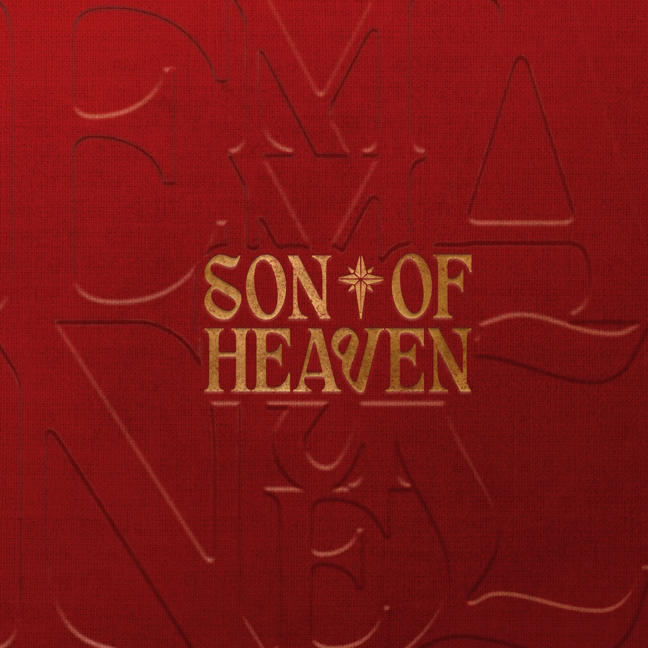
Album Cover:
For the Son of Heaven cover, I wanted something that felt like a treasured Christmas keepsake, like an old hymnal or a cloth-bound book pulled off the shelf. After several rounds of concepts, I landed on a deep red fabric texture with large serif lettering pressed into it, so it reads more as something you’d feel than something you’d notice right away. In the center, the title sits in textured gold with a small star between the words, a quiet nod to the Christmas story. Keeping it simple let the materials and type carry the mood: warm, reverent and timeless.
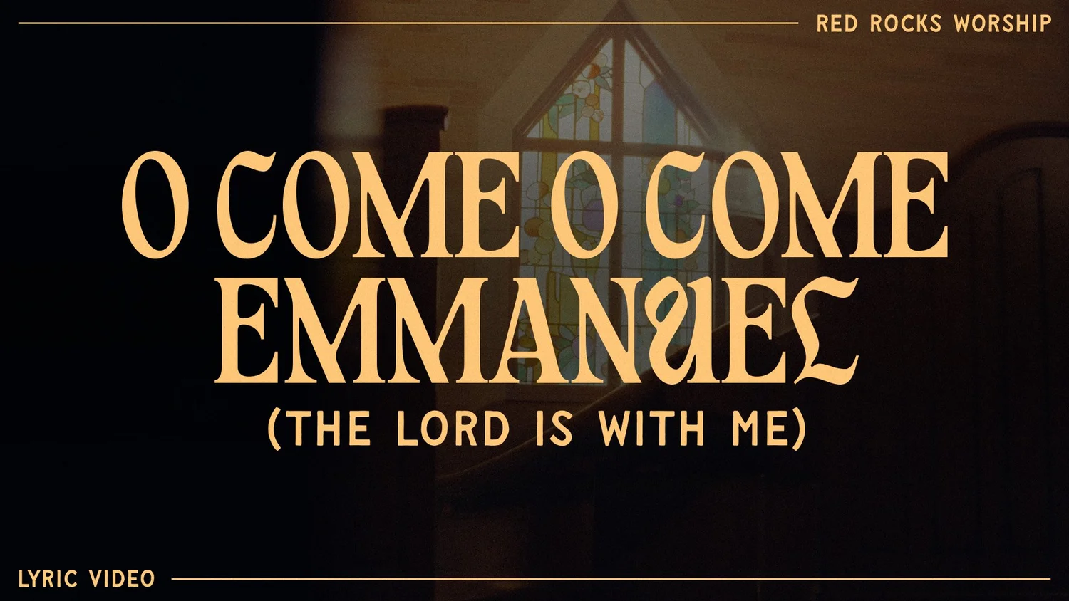
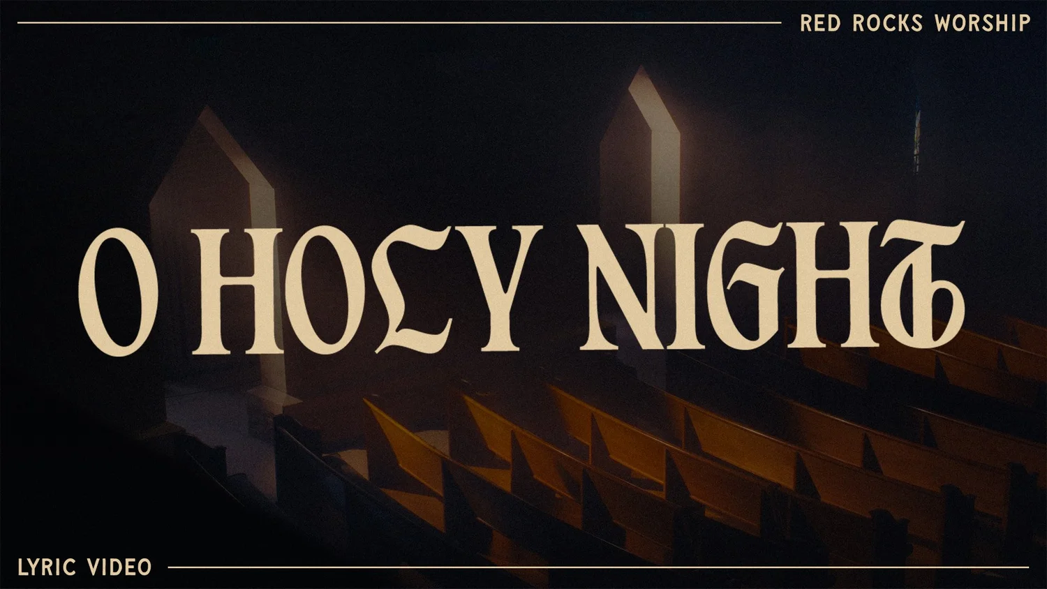
Thumbnails:
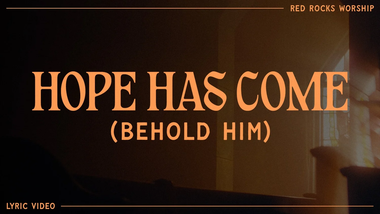
For the lyric video thumbnails, I wanted each song to feel like part of the same world while still having its own character. I pulled moody stills from the church footage, with stained glass, wooden pews and warm light through the windows, then darkened them so the song titles could take center stage. The titles are set large in the EP’s decorative serif, but I left out the textured gold from the album cover and used flat colors that match the ones our videographer used in each lyric video. That way the thumbnail flows straight into the video when someone clicks. Each song has its own color: warm gold for O Come O Come Emmanuel, soft cream for O Holy Night and a glowing orange for Hope Has Come. A simple frame of thin lines with “Red Rocks Worship” and “Lyric Video” ties all three together, so they look like a set when they sit side by side on the channel.
Church Promotion:
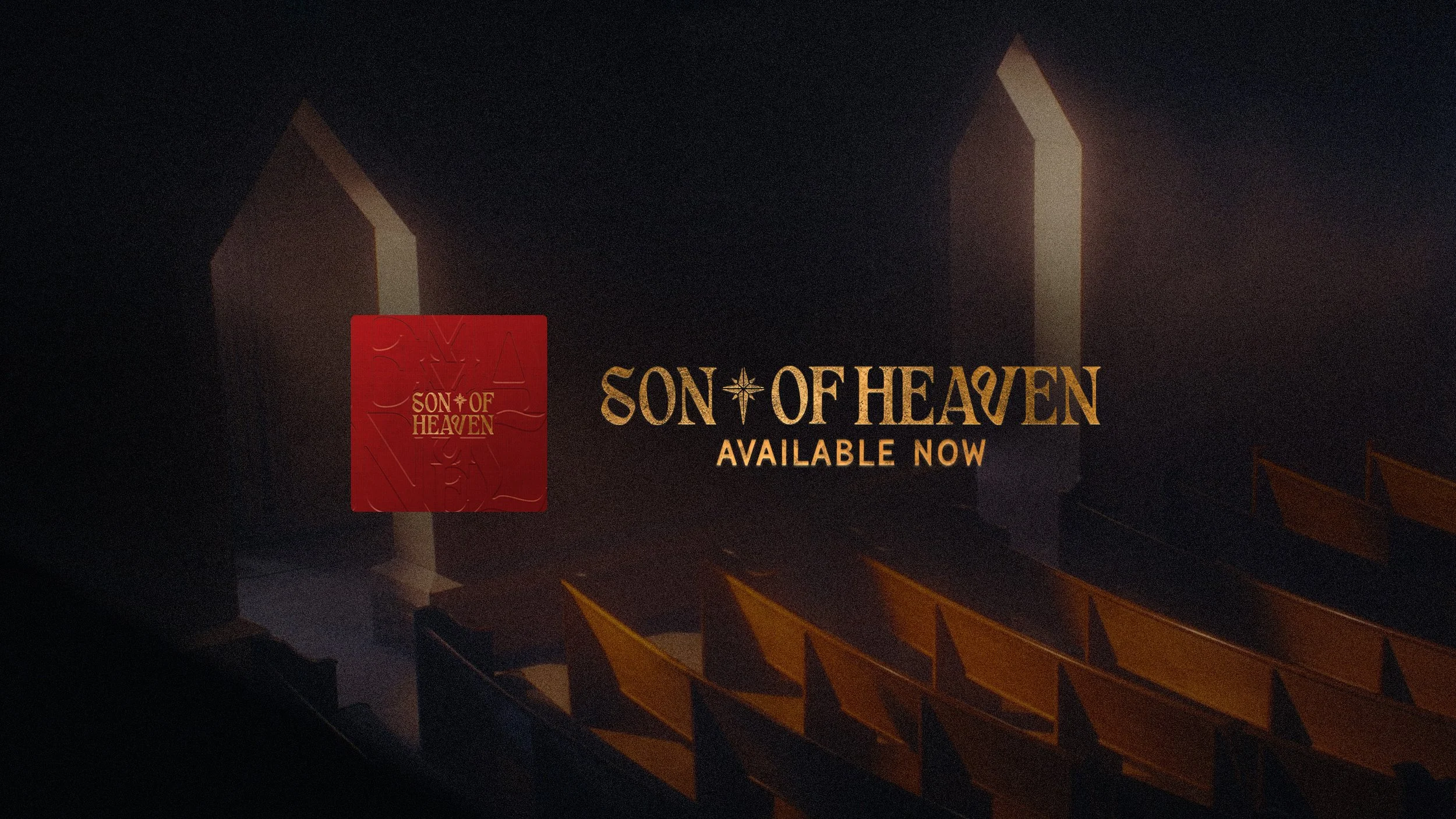
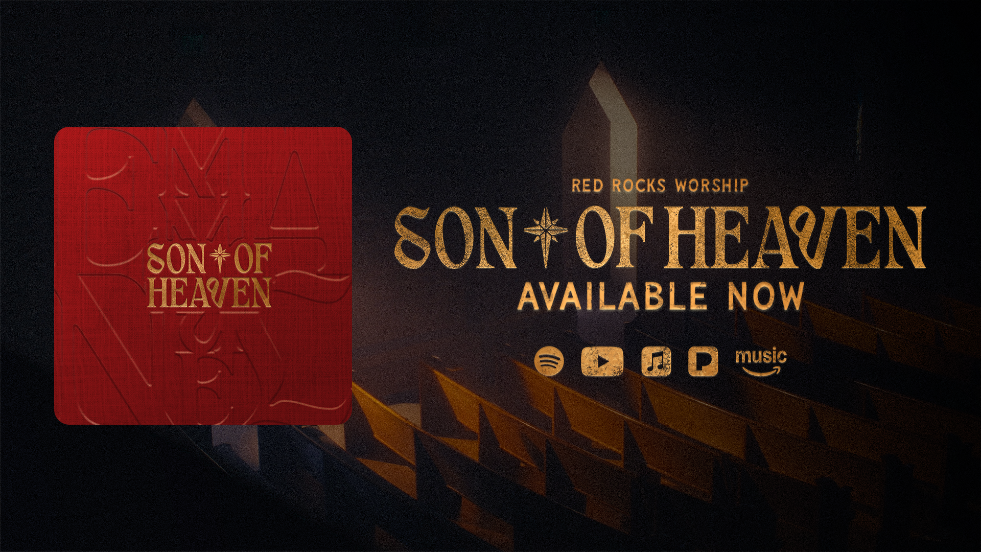
The 16x9 graphic was made to announce the release on screens and wide formats, including the Red Rocks Church app, where it puts the EP in front of the church community as they open the app. I set the album cover on the left so people would instantly recognize the EP, and placed it over a darkened still of the church pews from the video footage to tie it back to the lyric videos. On the right, the title is set in the textured gold logo with a clear “Available Now” underneath, followed by the Spotify, YouTube, Apple Music, Pandora and Amazon Music icons, all in the same gold. It’s a simple layout, but it puts the three things people need up front: what it is, that it’s out now and where to listen.
Youtube Promotional Banner:
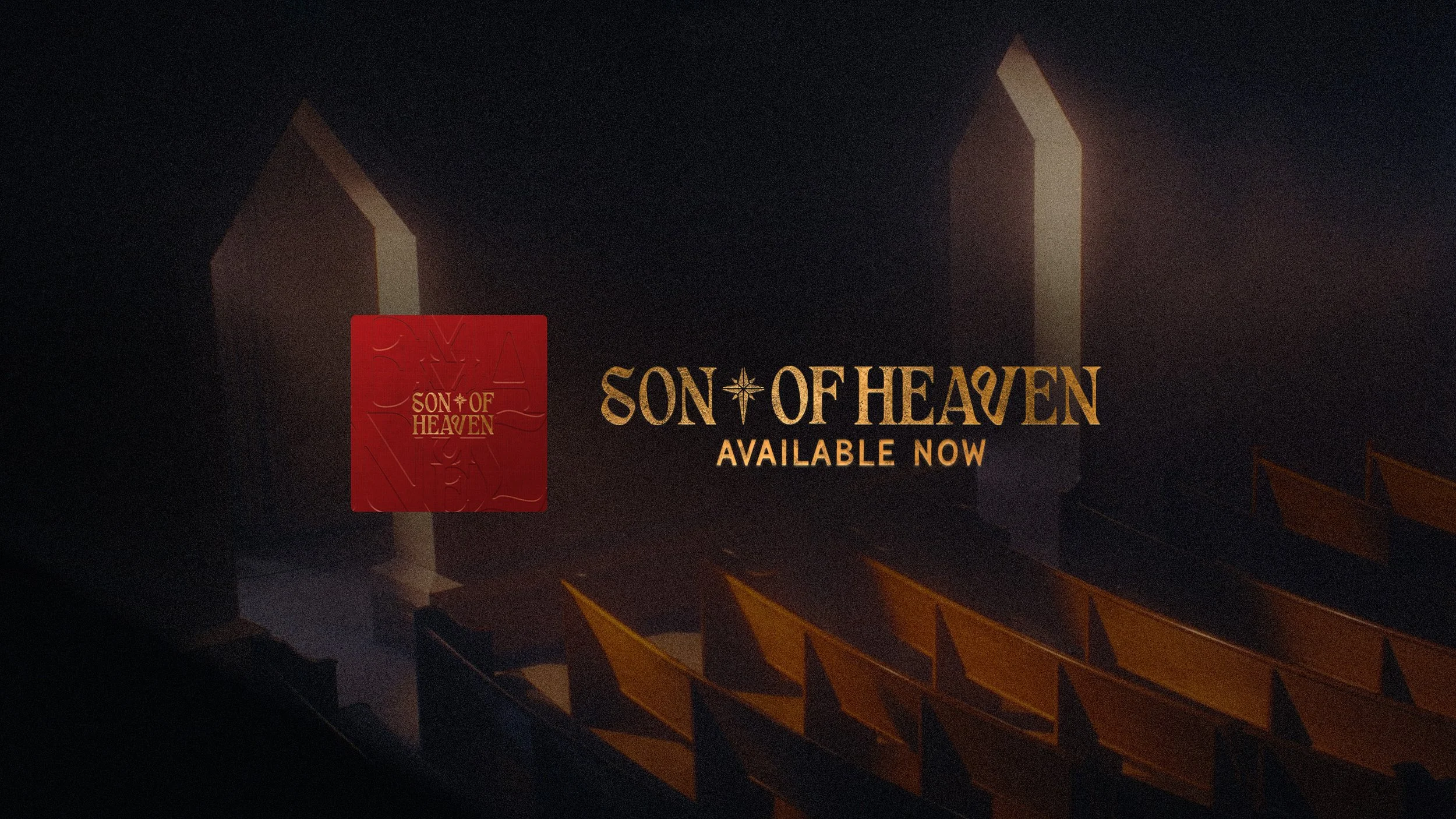
For the YouTube banner, I wanted the channel to feel fully dressed for the release when people landed on it. It uses the same darkened church still as the 16x9 graphic, with light coming through the tall windows and rows of pews glowing in the foreground, so the channel feels connected to the lyric videos. I kept the album cover, the textured gold title and “Available Now” small and grouped in the center. YouTube crops banners very differently on TV, desktop and mobile, so keeping everything inside the safe area means the message stays readable on any screen, while the rest of the scene fills the wider views.
Socials Graphics:
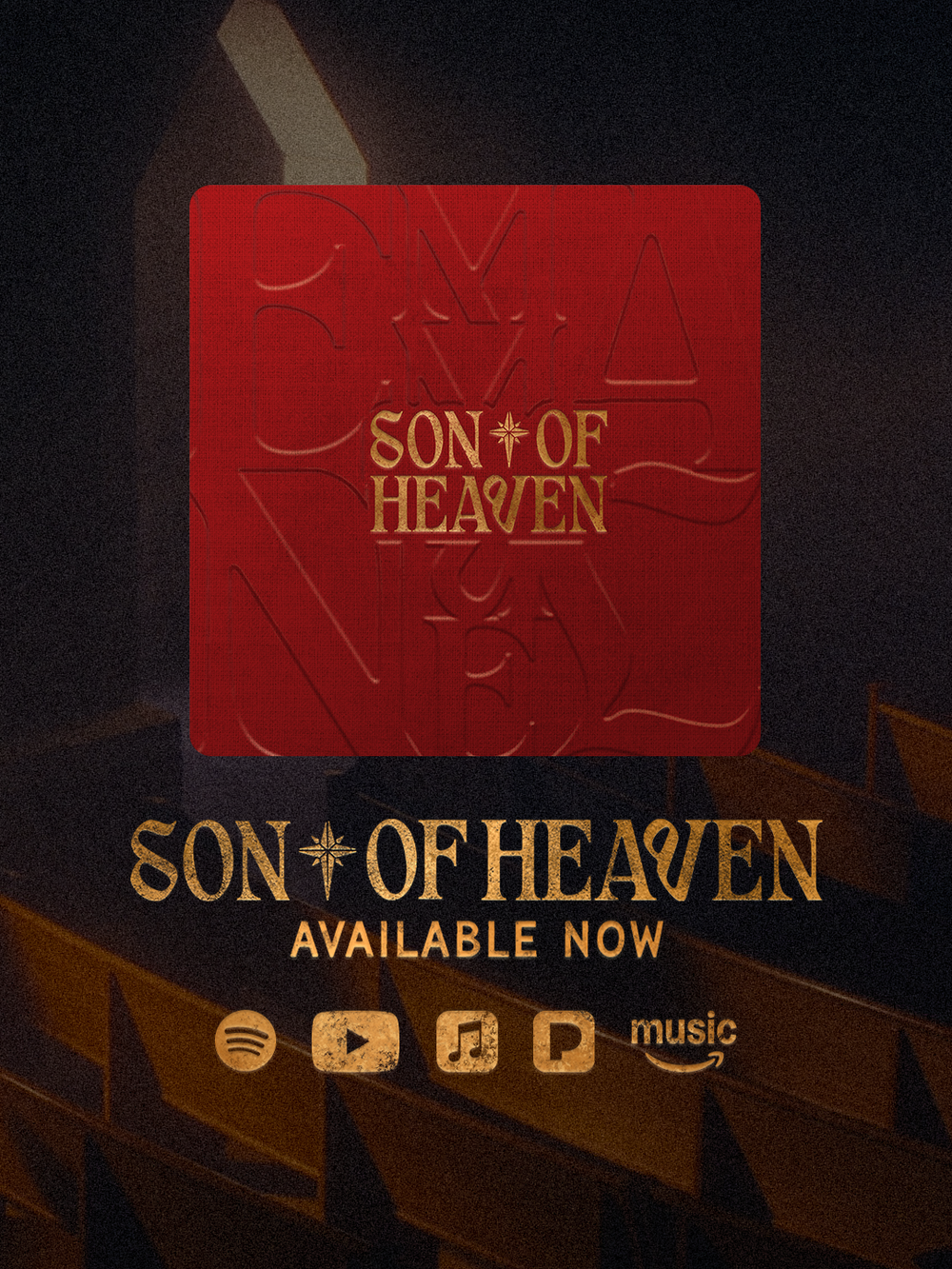
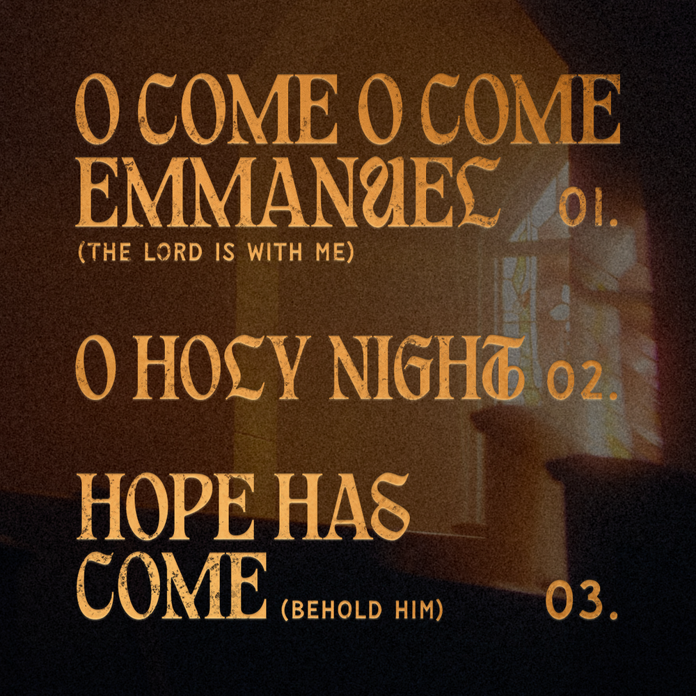
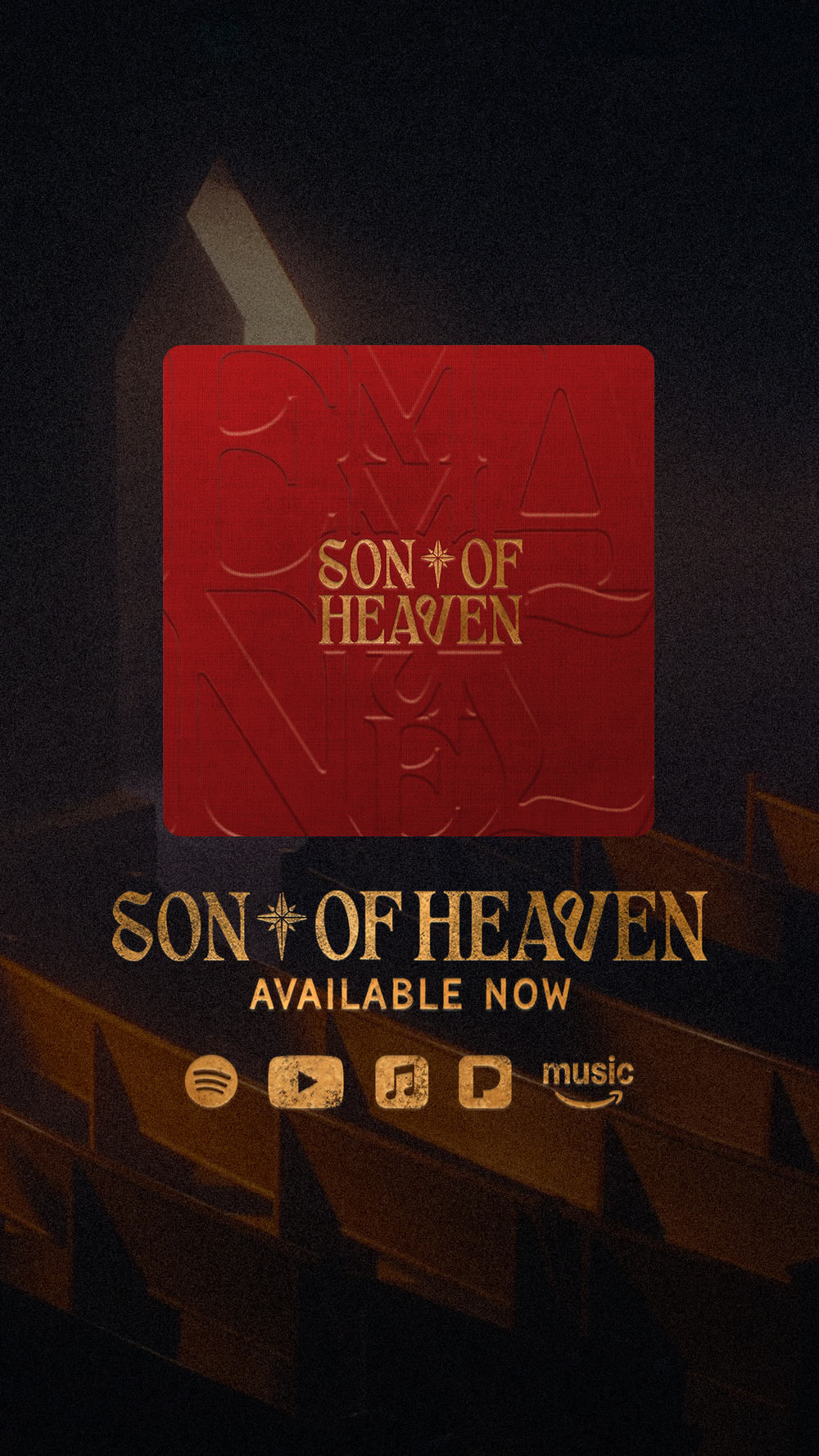
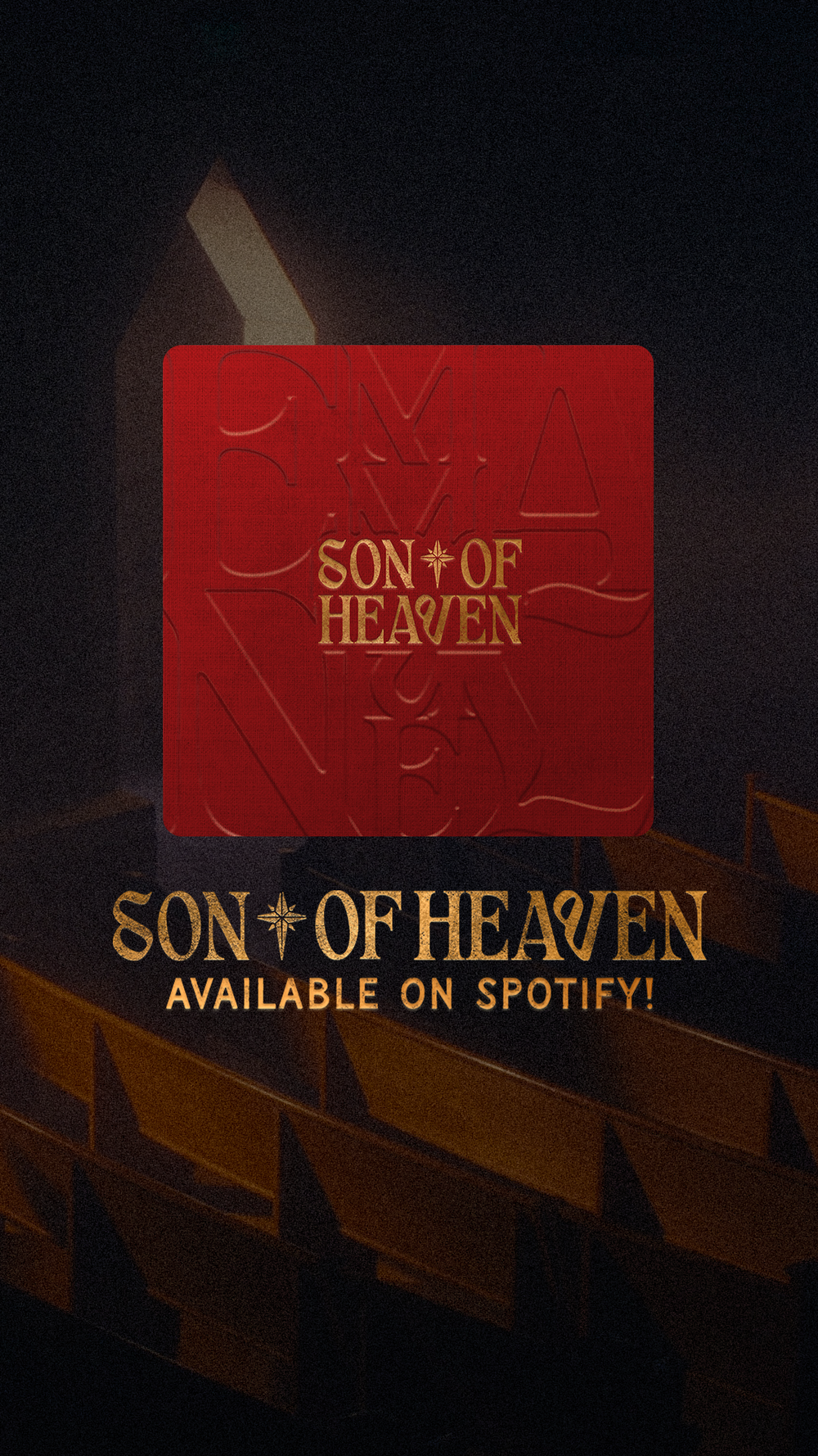
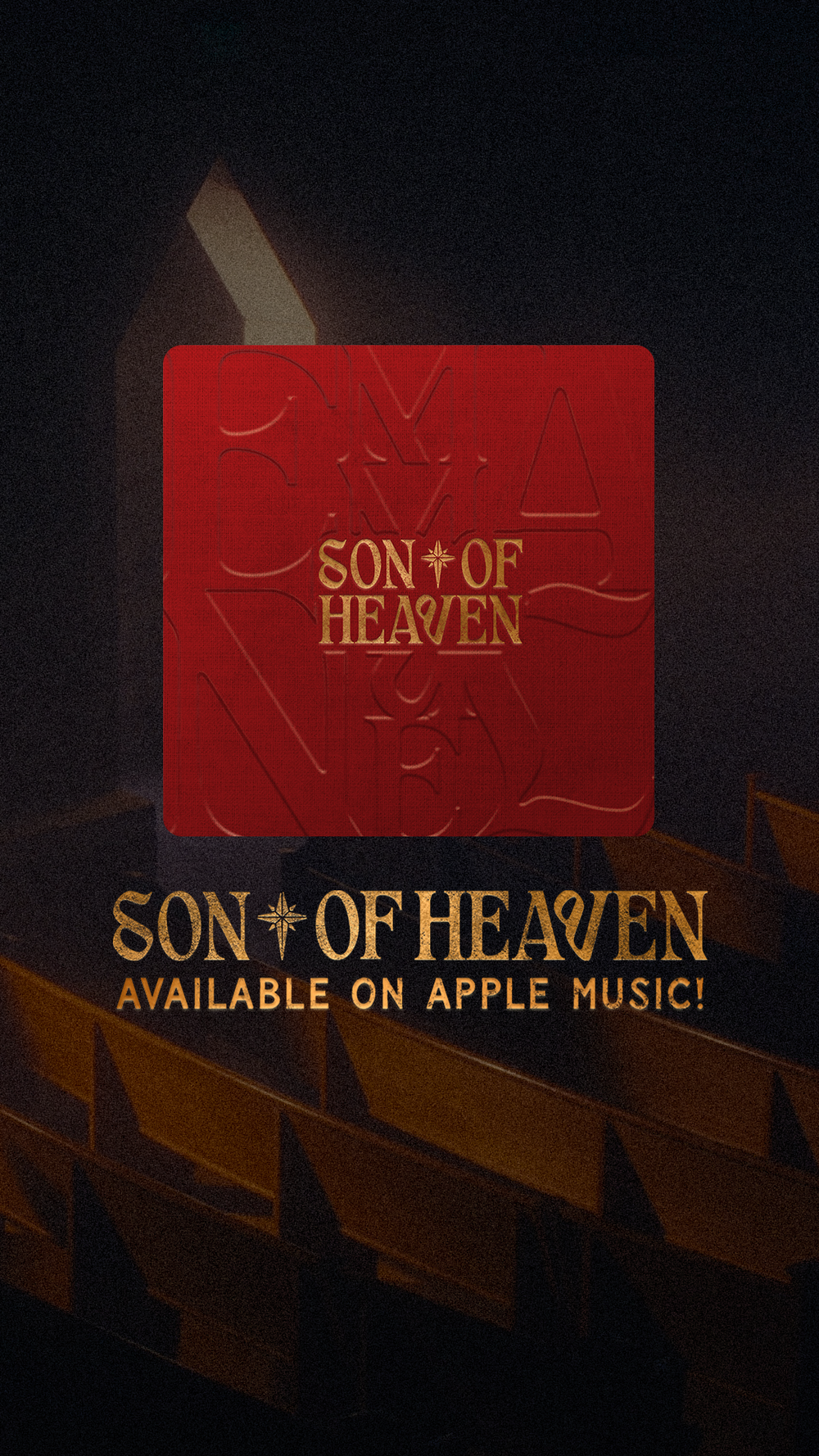
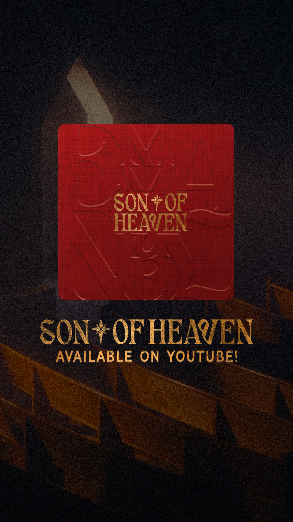
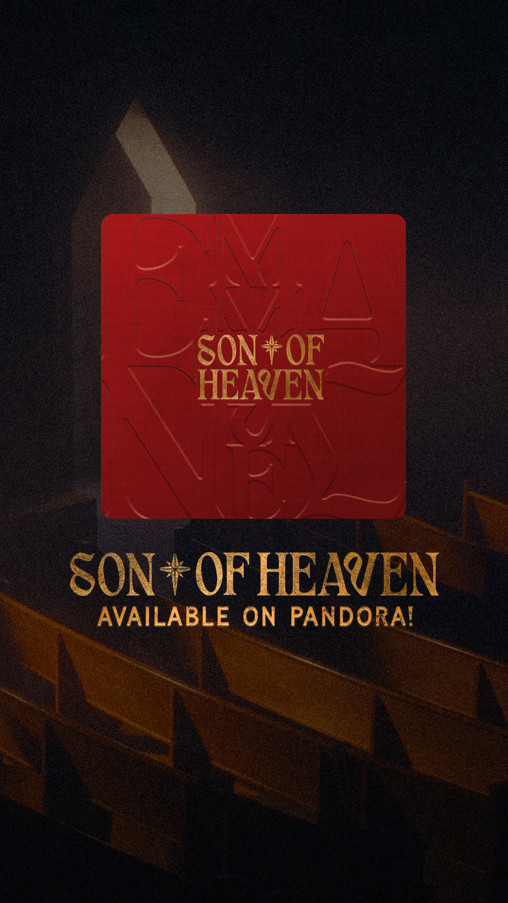
For release day, I made a set of social graphics so the EP showed up consistently everywhere people were scrolling. The main “Available Now” post and story put the album cover front and center over the darkened church pews, with the gold title, a clear call to action and the streaming platform icons below it. From there I made a story for each platform: Spotify, Apple Music, Pandora and YouTube. Each one swaps the icons for a direct “Available on…” line, so the team could share the right link to the right audience. I also designed a tracklist graphic that sets all three song titles large in the EP’s decorative serif with simple track numbers, over a warm, glowing still of the stained glass window. Together they kept the launch feeling cohesive while giving each post its own clear job.